


Another month, another fabulous challenge at More Than Words! And this month we have some fun new changes to our rules! Please see below.
We were thrilled there were so many entries for our February challenges,
and we hope that you will all play along again this month!
Here is our March Main Challenge board:

Our Main Challenge is based on a word inspiration and a creative challenge.
Word Inspiration - COMFORTABLE
Creative Challenge - COLOUR COMBO
What does the word COMFORTABLE inspire you to create?
You can choose to use the actual word somewhere on your project
or simply be inspired by it. Since words are an integral part of our challenges, we want to know how this month's word stimulated your creative process, so please do explain in your blog post how it inspired you if it isn't obvious in your work.
This month, we offer you a beautiful COLOUR COMBO as the creative challenge. Your task is to use at least 3 colours from our cozy colour palette. You can combine with any neutral colour like white, black, ivory or kraft. So snuggle down, get comfortable and start creating!
This month, we offer you a beautiful COLOUR COMBO as the creative challenge. Your task is to use at least 3 colours from our cozy colour palette. You can combine with any neutral colour like white, black, ivory or kraft. So snuggle down, get comfortable and start creating!
Please check out all our challenge rules in the RULES tab above.
Now let's see what our amazing DT have come up with !


Sivan: My family is totally what makes me feel most COMFORTABLE. They make me feel important and essential; they need me and give meaning to my life. This COLOUR COMBO so suited me in creating this layout because the colours are so calm, pleasant and embracing, all of which really connected me easily to my family.

Anguree: Lots can be said about everyday pleasures, but few things work in so many situations. For me, it's coffee... and ok, chocolate too, but with coffee, you can have more of it without the guilt. Whether I need to wake up, stay awake longer, take a breather or just enjoy a little quiet moment, coffee always makes me feel a little better, a bit more COMFORTABLE. And as much as I love coffee, I love the COLOUR COMBO creative challenge. I used all of the colours offered.

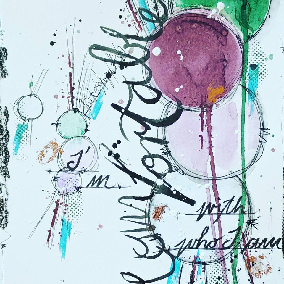
Martina: This month I decided to use 2 of the darker colours in the COLOUR COMBO challenge and 1 of the light shades. I chose a beautiful photo of a beautiful woman to match. The sentiment behind the face is about me though. Even if not all the time, I do feel COMFORTABLE with who I am and I think every
one of us should the same way.

Mary: The word inspiration brought to my mind a cozy morning in the lounge with a warm blanket. So with that in mind, I used a photo of a cat wrapped with a blanket and feeling so COMFORTABLE and happy. For the COLOUR COMBO challenge, I used the purple and blue/green shades along with some white.

Heather: One of my most striking memories of comfort was the rooms at the pubs and B&Bs in England. Many of them were so snuggly and COMFORTABLE, especially when it was cold and wet outside! I chose to use the teals and the white colour which proved to be a challenging COLOUR COMBO for me.

Nicole: Sugar the cat has the habit of getting COMFORTABLE in the most inappropriate places, like a basket of freshly washed sheets which we were too lazy to fold and store right away. She looks so cozy and cute that we let her be, knowing that the sheets would just have to be washed again. I really loved the COLOUR COMBO... so warm and inviting. I do believe that I have managed
to incorporate all 5 of the colours unto my page.

Janice: This quote inspired me to create a layout about my beautiful daughter... 'Always be you, be beautiful and be COMFORTABLE in your own skin. Embrace yourself for all you are.' I chose the purple tones from the COLOUR COMBO
and added a touch of gold.

Anat: Art journal is usually a COMFORTABLE media to create in, but for me, as I left it behind for a while, it is not my comfort zone anymore. That's why I decided to use it as my inspirational project together with the brilliant quote I found: 'Get comfortable being uncomfortable. Get confident with being uncertain. Don't give up because something is hard. Pushing through challenges is what makes you strong.' I incorporated the COLOUR COMBO by playing around with purples, lilacs and white.
Heike's: I am COMFORTABLE with who I am. I have a healthy and happy family, a husband I love more than anything. I am healthy and I can spend my days doing what I love. For that I am unspeakably thankful and happy. I wanted to express this artistically on my art journal page. The COLOUR COMBO was perfect
for the sentiments expressed.
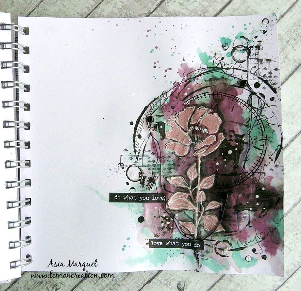
Asia: To me the word COMFORTABLE means staying in my comfort zone and creating what I love the most, art journal pages. It's also showing a little bit of my soul and all the things that I love, like flowers, circles and wire. This is my comfort and this page brings me peace. For the COLOUR COMBO I used purple,
light aqua green, grey and black.

France: COMFORT to me is cozying up to a warm fire with some warm socks and a hot tea or coffee. Oh, how I wish I could spend my days in my PJs! When I get home from a busy day at work, I just love my wool socks and relaxing while I read a good book. I chose the grey, light and dark teal greens in the COLOUR COMBO because it was taking me out of my comfort zone. I never play with these colours
and enjoyed the challenge.

Pamela: What's more COMFORTABLE than snuggling? On the photo is my granddaughter Lilly snuggling our boy Flash while watching cartoons. These 2 were inseparable until Flash passed away. For the COLOUR COMBO,
I used purple, green and white.

Caroline: There's nothing more COMFORTABLE than a family cuddle on a snowy lazy Sunday. I used some badges that remind me of those moments that I cherish. The COLOUR COMBO was easy to use for me as these are colours that make me happy.

Daisy: When I see Madie, the little puppy we adopted, lying in her big bed, I think she looks COMFORTABLE. She seems physically comfortable to be in a soft bed, but she also seems to be comfortable with her new family. One thing is certain, she will have a comfortable life with us. I chose white as well as light and dark purple from the COLOUR COMBO to create a soft and cozy layout.

Valerie: I used a picture of my son with his cat. The photo shows cat hugs are the most COMFORTABLE. I used the turquoise and green shades of the COLOUR COMBO.

Rosalie: This is a picture of my little dog, Serge. We adopted him through an organisation that rescue dogs from the pound. My aim is to provide him a safe home with lots of comfort. That's his favourite spot in our lounge, in his COMFORTABLE blanket. I added some purple flowers and paints to my page,
inspired from the COLOUR COMBO.
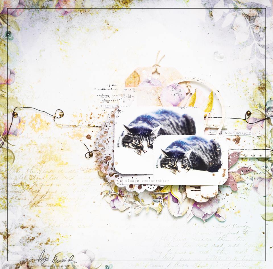
Aga: My big cat is always looking for a COMFORTABLE place to sleep. When my children go to school, he hops on the couch and sleeps throughout the day. From the COLOUR COMBO, I added lots of white and some lighter shades of purple and green.
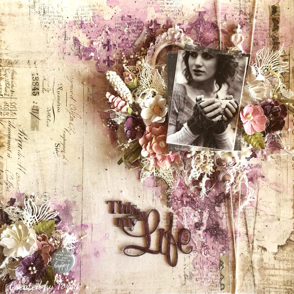
Torsa: To me, being on my own with a cup of coffee is the most COMFORTABLE thing in this world. I love to be with myself! I chose purple, white with
little touches of green from the COLOUR COMBO.
How can you not be inspired by these fabulous projects from our DT!?
Now, let's take a look at the prizes up for grab this month!

All our prizes include free international postage!
MAIN CHALLENGE WINNER
(as voted by our DT)
$50 USD value prize from DUSTY ATTIC
(image below is for illustration purposes only)

4 RUNNERS UP
(as voted by our DT, in no particular order)
$25 USD value prize from MAJA DESIGN

$25 USD value prize from THE SCRAPBOOK DIARIES

$25 USD value prize from MINTAY
$25 USD value prize from CREATIVE EMBELLISHMENTS

RANDOM WINNER
(picked at random from all eligible entries)
MYSTERY WINNER
(hand picked by our Admin team - an entry not in our Top 5,
but that has that special something that captured our attention)
$25 USD value prize from FABRIKA DECORU

We are very grateful to all our generous sponsors for these fabulous prizes. To learn about any of them, click on the SPONSORS tab above.
We are looking forward to seeing your entries into our
March Main Challenge COMFORTABLE & COLOUR COMBO!
Link up your projects using our LinkyTool in the right sidebar
by March 31st at 11:55 pm EST.

Very insirative!!!
ReplyDeleteWhat beautiful inspiration. Love them all!
ReplyDeleteAmazing works!!
ReplyDeleteBeautiful inspirations! These colours are very difficult for me, but maybe I'll try do something :)
ReplyDeleteBeautiful things have been shown in this blog thank you so much.
ReplyDeletei personally loved the AGA BARANIAK
Wow!! What a beautiful works! Thanks Design team for sharing and inspiring <3
ReplyDeleteBeautiful projects , love the mood board 💖
ReplyDeleteLove
Riddhi
Amazing and wonderful inspirations from all DTs. Love the mood board so much.
ReplyDeleteHugs
Dr Monika Tripathi Shukla